One of America’s most beloved snack brands just refreshed its logo for the first time in 18 years.
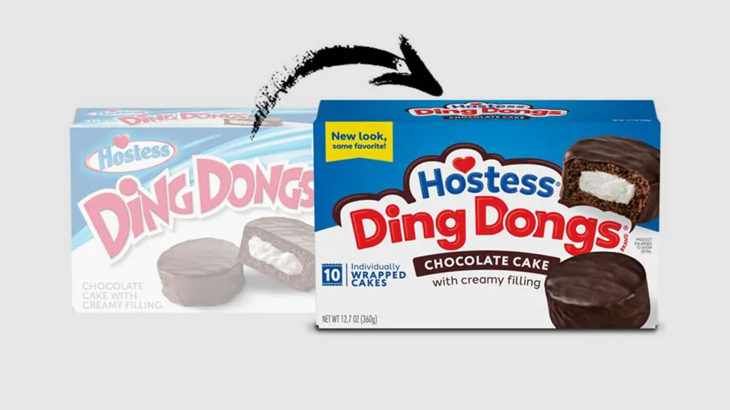
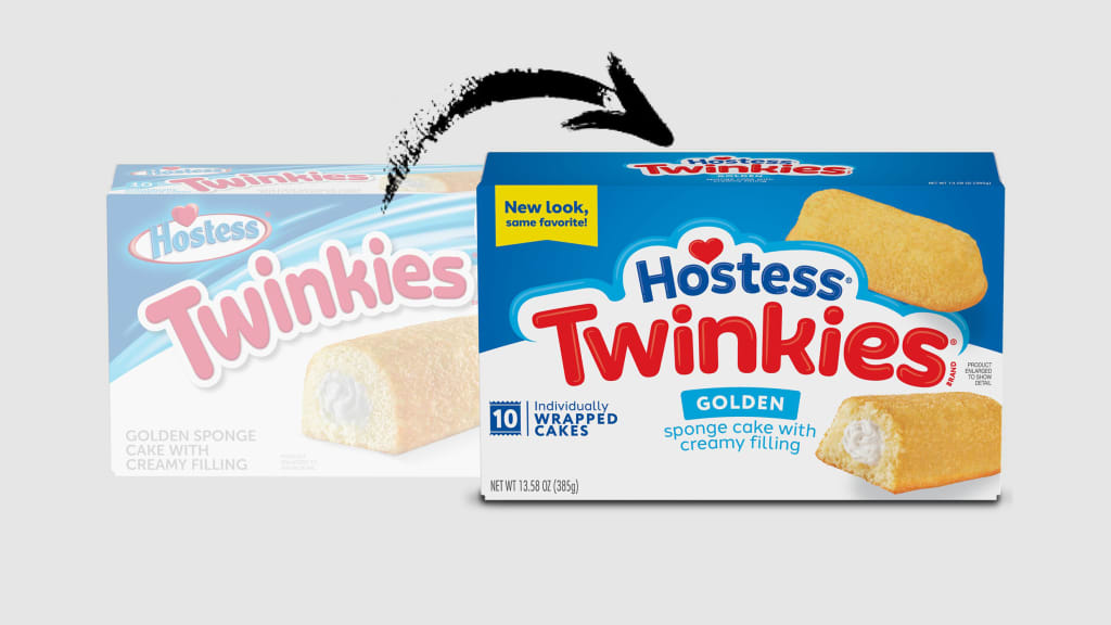
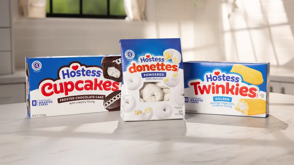
Hostess, the maker of snacks like Twinkies, Ding Dongs, and Zingers, announced a subtle new rebrand, which includes updated packaging and a revamped logo, today. The new logo is simplified and flat, dropping the drop shadow and gradient of the old logo and replacing it with a logo that uses a new font, brighter colors, and a cloud-like border the company says conveys “the light and airy quality of every Hostess snack.” The heart in the logo remains, and the logos for each individual snack brand were similarly updated in new fonts.
“This effort supports our commitments to modernize the brand while promoting the quality and taste that helps differentiate our products,” Aundrea Graver, director of marketing at Hostess parent company J.M. Smucker Co. tells Fast Company in a statement. “Our goal is to excite current fans and encourage new fans to engage with the brand.”

Hostess says it conducted the redesign with multiple rounds of consumer testing, including having consumers evaluate packaging concepts and testing the products on a virtual store shelf to see how it might stand out in stores. They found consumers prefer the new packaging two to one.
The J.M. Smucker Co., best known for its jams and brands like Jif peanut butter and Uncrustables, acquired Hostess in 2023 for $5.6 billion. At the time of the sale, Smucker said the acquisition would benefit the company’s net sales growth, operating margin, and earnings growth, but one year later, sales have underperformed and Hostess laid off employees in August.

Smucker President Mark Smucker blamed the company’s challenges with Hostess on “continued cautiousness of the consumer in terms of inflation and lower discretionary income” as well as execution on the company’s part, but he promised a turnaround was coming.
“We really have started to pivot,” Smucker said on the company’s most recent earnings call, citing the new packaging, and a new advertising and marketing campaign in the new year that will “speak to the emotional connection to the brand,” as well as more display and distribution, something that’s especially important for a product that’s often an impulse buy.

“We still feel really excited about Hostess,” Smucker said, adding that he expected to see improvements in the coming quarters. “We love the brand.”
A yellow banner on the new packaging says “New look, same favorites!” but it’s unlikely consumers will be too confused by Hostess’ rebrand. The snack company’s revamped logo looks more modern without straying too far from the original look. Sounds like a recipe for success.


